
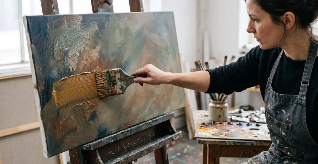
A brushstroke can describe the curve of a shoulder, the violence of a storm or the trembling edge of a shadow. But it can also reveal something beyond the object being painted: the physical act of painting itself. When a mark remains visible, its direction, thickness, interruption and rhythm become part of the viewer’s experience.
Loose brushstrokes can convey feeling more immediately than smooth blending because they preserve evidence of gesture. Instead of presenting only a finished illusion, the painting exposes decisions made by a moving hand. A forceful diagonal, an abrupt change of direction or a broken line can suggest urgency, instability or resistance. These associations are expressive possibilities, not guaranteed emotional responses.
Smooth blending has its own emotional vocabulary. It can create stillness, tenderness, atmospheric depth and concentrated attention. The difference is not that gesture contains emotion while refinement does not. It is that each allows the painter to communicate through a different relationship between surface, movement and presence.
The challenge for contemporary painters is to make that relationship intentional. A painting filled with uncontrolled marks is not automatically expressive. Energy becomes meaningful when every gesture contributes to an organised visual experience.
What makes expressive brushwork emotionally powerful?
- Visible strokes preserve directional movement, material variation and traces of the painter’s decisions, making gesture part of the image.
- Strong value structure, selective detail and quieter passages allow bold marks to communicate without becoming chaotic.
- Preserving fresh colour relationships and resisting unnecessary correction often protects the vitality of expressive painting.
- Why Do Van Gogh’s Swirling Strokes Feel More Emotionally Intense Than His Actual Subjects?
- How Do You Make Expressive Brushwork Look Spontaneous Without Becoming Chaotic?
- Refined Detail vs Bold Gestures: Which Brushwork Style Creates Intimacy Versus Drama?
- The Overworking Trap: When Refining Expressive Brushwork Kills Its Spontaneous Energy
- The Commitment Moment: When to Trust Your First Brushstroke Without Correction
- The Brushwork Mistake That Turns Vibrant Colours Into Grey Mud
- The Theory-Intuition Balance: When to Follow Colour Rules Versus Your Gut
- Which Core Painting Methods Separate Amateur Attempts From Professional-Quality Results?
Why Do Van Gogh’s Swirling Strokes Feel More Emotionally Intense Than His Actual Subjects?
Van Gogh‘s swirling brushstrokes can feel emotionally intense because they transform a relatively recognisable landscape into an active field of movement. Curved marks, changing directions and varied paint textures make the surface seem restless. Rather than simply observing stars, trees or hills, the viewer encounters the energy of the marks describing them. That energy may evoke turbulence, wonder or heightened attention.
Consider The Starry Night, painted in 1889. Its night landscape contains familiar elements: a village, a dark cypress and luminous celestial forms. Yet the painting’s atmosphere depends heavily on how the sky has been constructed. Short, thick strokes follow sweeping curves and concentric movements that seem to animate the space between the objects.
According to MoMA‘s analysis of The Starry Night, the composition combines expressiveness with careful balance. The placement of the cypress, steeple and central swirling forms provides organisation beneath the apparent turbulence.
This distinction matters. The sky does not become dynamic merely because it depicts a dramatic subject. Its movement is created through the relationship between directional marks and the overall composition.
Directional strokes invite the eye to travel along visible pathways. Curves encourage a sense of circulation; abrupt diagonals can suggest acceleration or instability. These are useful artistic interpretations of visual movement, although no single direction produces the same emotion in every observer.
Van Gogh’s development offers another comparison. Earlier paintings such as The Potato Eaters emphasised earthy colour, human character and a comparatively realist approach. His later paintings often gave colour and surface a more pronounced expressive role. The contrast is not between completely smooth early painting and exclusively gestural late painting; the development is more nuanced.
The National Gallery‘s examination of Landscape with Ploughman, also from 1889, identifies angled strokes, heightened colour and concentric marks around the sun as important expressive features. The represented landscape remains recognisable, but its handling communicates more than its literal subject.
Impasto alone is not the secret. Thick paint applied in repetitive, equally weighted marks can become visually predictable. A thin, sharply redirected stroke may feel more urgent than a heavy but mechanical application.
For a studio experiment, paint the same simple landscape twice. In the first version, suppress the boundaries between strokes. In the second, let changes in pressure, direction and spacing remain apparent. Compare how each version guides attention before deciding which communicates your intended feeling.
The lesson is not to imitate Van Gogh’s curves. It is to recognise that paint handling can carry an independent expressive message. Giving those marks a deliberate structure is what makes their freedom convincing.
How Do You Make Expressive Brushwork Look Spontaneous Without Becoming Chaotic?
Expressive brushwork looks spontaneous without becoming chaotic when individual gestures belong to a clear visual hierarchy. Establish the major value masses, choose a dominant direction of movement and reserve strong contrasts for selected areas. A mark may be swift and irregular while still serving a deliberate purpose. The goal is organised freedom, not random activity.
The appearance of spontaneity should not be confused with the absence of preparation. A painter might spend considerable time determining the composition before applying a small number of decisive strokes. Another painter might develop structure through successive improvisations. Either approach can succeed when the relationships between marks remain coherent.
A useful method is planned looseness: establish the broad architecture before allowing local gestures to become unpredictable.
- Reduce the image to major values. Identify the dominant light, middle and dark shapes. Check that the composition remains legible when viewed from across the room.
- Assign directional roles. Give each major zone a principal movement, such as descending diagonals in the background or broad horizontal sweeps in the foreground.
- Concentrate the strongest gestures. Allow selected areas to carry the greatest directional contrast while surrounding passages remain comparatively restrained.
- Review the painting at a distance. Check whether the strokes reinforce the subject’s movement or compete without a discernible order.
A landscape provides a practical example. A hillside might be constructed with repeated diagonal gestures following its slope, while the sky is described with broader horizontal marks. Individual strokes can vary considerably, yet each area maintains a recognisable directional character.
Apply the one decision per stroke test. Before making a mark, identify its primary task. Is it clarifying an edge, shifting temperature, reinforcing movement or establishing a new value? A single stroke can perform several functions, but it should have a reason to exist.
This does not prohibit experimentation. An exploratory mark can be intentional when it tests a visual possibility. The danger is continuing to add marks after their purpose has become unclear.
Warning signs include an inconsistent light source, high contrast distributed equally across the canvas, competing directional systems and passages whose colour has become unintentionally mixed.
Quietness is an active compositional choice. A simplified background gives the eye somewhere to rest, making the force of a nearby gesture more perceptible.
Successful spontaneity does not eliminate structure; it makes structure feel alive. Once the painting has a clear directional and tonal foundation, refinement and gesture can be combined without sacrificing either intimacy or drama.
Refined Detail vs Bold Gestures: Which Brushwork Style Creates Intimacy Versus Drama?
Refined detail often creates intimacy by encouraging close observation, subtle transitions and prolonged attention. Bold gestures more readily suggest immediacy, movement and dramatic physical presence. Neither effect is exclusive to one technique: smooth blending can create psychological intensity, while restrained gestures can feel deeply personal. The stronger choice depends on the subject, viewing conditions and intended emotional atmosphere.
In carefully modelled portraiture, a softened transition across the cheek or around the eyes can encourage the viewer to dwell on subtle expressions. Paint handling withdraws from attention, allowing small differences in light and form to become prominent.
Visible gesture operates differently. A loaded stroke describing a shoulder, for example, makes the artist’s movement perceptible alongside the represented anatomy. This additional layer can make the image feel more immediate.
Yet the distinction is not simply Vermeer versus Abstract Expressionism. Controlled handling can create tension through extraordinary stillness, while a gestural surface can communicate fragility rather than force.
Consider the following decision framework before choosing your brushwork.
| Creative criterion | Refined or blended handling | Bold visible gestures |
|---|---|---|
| Emotional intention | Stillness, contemplation, subtle intimacy | Urgency, movement, immediacy |
| Subject matter | Delicate expressions, fine tonal changes | Dynamic figures, weather, energetic abstraction |
| Viewing distance | Rewards close examination | Can communicate strongly from farther away |
| Human figure | Emphasises nuanced form and expression | Emphasises posture, movement and physical presence |
| Typical revision risk | Excessive blending may flatten transitions | Repeated correction may interrupt gestural continuity |
Contrast between handling styles is often more expressive than committing to either one throughout the painting. A portrait might contain closely observed eyes, broadly indicated hair and a background formed from rapid directional strokes. The shift in technique directs attention while implying a psychological relationship between the figure and its surroundings.
Research discussed by National Gallery of Art in its examination of Mark Rothko’s working process shows that expressive surface handling can involve deliberate variations in edges, layers and brushwork. Some of Rothko’s works preserve drips and visible strokes alongside carefully established boundaries. Gesture and control therefore need not be opposites.
The practical cost of refinement is the time and precision needed to preserve subtle relationships. The cost of gestural painting is that uncertainty can remain conspicuous in every unnecessary correction. Neither technique is inherently more authentic or more difficult.
Choose the handling that supports the intended experience, then allow contrasts in technique to strengthen it. This also makes knowing when to stop especially important: the wrong finishing stroke can erase the very difference that gives the painting its character.
The Overworking Trap: When Refining Expressive Brushwork Kills Its Spontaneous Energy
Overworking expressive brushwork can weaken its energy by repeatedly softening edges, interrupting distinct directional marks and physically mixing colours that were more effective when separate. The result may feel flatter because formerly contrasting decisions begin to resemble one another. Refinement becomes destructive when it removes useful information rather than resolving a genuine problem.
Imagine a freshly painted passage containing a bright orange stroke beside a blue-violet shadow. Their boundaries remain visible, creating clear differences in hue, value and temperature. Repeatedly dragging a brush across the junction can combine the pigments and soften the separation.
The resulting mixture may become lower in chroma, depending on pigment composition and proportions. It does not necessarily turn into neutral grey. What matters is that repeated physical mixing can eliminate a colour relationship the painter initially intended to preserve.
The same process affects edges. A painting with some firm boundaries and some soft transitions can direct the eye through contrasting visual information. Blend every boundary and the hierarchy may weaken.
The National Gallery of Art’s educational material on Monet‘s methods distinguishes adjacent colour relationships from physical pigment mixing. Its discussion of simultaneous contrast helps explain why separate neighbouring colours can create effects that do not survive blending.
Overworking often begins with a psychological impulse: discomfort with an exposed irregularity. A painter notices a crooked contour, a slightly uneven mark or a visible brush ending and assumes it needs correction.
But an imperfection is not automatically an error. The unexpected break in a stroke may strengthen movement, introduce rhythm or prevent an area from becoming mechanically uniform.
A practical stopping method is the 80% test. This is a studio heuristic, not a scientifically established completion threshold. When a painting appears largely resolved, step away and assess what an additional mark would contribute.
- Are important edges sufficiently varied, or has every transition become similarly soft?
- Are differences in warm and cool colour still serving the composition?
- Do the dominant stroke directions remain visible?
- Is the proposed correction solving a structural problem or merely hiding an irregularity?
When wet paint has become physically muddied, further blending may deepen the problem. Depending on the medium and paint condition, removing the affected passage with an appropriate tool and restating it after suitable preparation may be more effective than continuing to mix in place.
Material limitations are important. Scraping is not suitable for every surface, paint film or stage of drying. Watercolour, acrylic and oil require different approaches, and aggressive removal can damage a support or disturb underlying layers.
Before attempting recovery, identify the medium, assess whether the paint is workable and test the intended intervention on a separate study when uncertain. Sometimes preserving an imperfect passage is preferable to risking irreversible damage.
The purpose of stopping is not to preserve every early decision. It is to protect marks that still carry useful visual information. That distinction leads directly to the moment when a first stroke deserves to remain untouched.
The Commitment Moment: When to Trust Your First Brushstroke Without Correction
Trust your first brushstroke when it communicates the intended value, direction or visual relationship, even if its shape is not perfectly controlled. Decisive painting does not mean refusing all revision. It means distinguishing a useful irregularity from a genuine structural error. Preparing values, colours and compositional priorities before painting makes that judgement easier.
Hesitation frequently begins before the brush reaches the canvas. An artist may still be choosing between warm and cool colour, uncertain about the main tonal relationship or undecided about the movement of a shape.
Those unresolved choices become visible as tentative marks. The brush moves slowly, changes direction repeatedly or returns to correct an area that never had a clear initial purpose.
Preparation reduces these competing decisions. A small value sketch can establish the dominant light and dark masses. Premixed colour pools can simplify colour choices. A clear sense of the focal area can help determine where the most emphatic gesture belongs.
Once painting begins, distinguish two kinds of dissatisfaction. An imperfect stroke may have an irregular edge or unexpected texture while still contributing to the composition. A genuinely wrong stroke may disrupt the intended value pattern, introduce an incompatible direction or destroy an essential relationship.
The first deserves examination before correction. The second may need to be changed.
Use a simple decision rule: if another stroke adds necessary information, consider making it; if it merely conceals the first stroke’s individuality, stop. This is a practical filter, not an absolute prohibition against revision.
Indeed, the National Gallery of Art’s research into Rothko’s paintings documents experimentation with layers, edge definition and surface handling. Visible traces of making can coexist with extensive artistic revision. A painting does not become inauthentic because its maker reconsidered a decision.
A five-action brushstroke commitment exercise
- Draw a simplified three-value composition before painting. Deliverable: one small sketch with clearly distinguishable light, middle and dark masses.
- Prepare three usable colour mixtures for the principal passages. Deliverable: three separate colour pools on the palette.
- Identify the intended direction and visual purpose of five major strokes. Deliverable: a short annotated stroke plan.
- Paint the five strokes without immediately blending their edges. Deliverable: a study retaining five identifiable gestural marks.
- Inspect the study from a distance and record which marks clarify the composition and which genuinely interfere with it. Deliverable: a brief keep-or-correct assessment.
The exercise trains selective judgement rather than rigid restraint. A stroke that communicates its purpose should not be erased simply because its contour differs from the painter’s original expectation.
Retained marks allow viewers to encounter traces of the painting’s development, although they cannot reliably reveal the artist’s actual emotional state. Preserving that visible decision history becomes especially valuable when colour itself is at risk of being blended into dullness.
The Brushwork Mistake That Turns Vibrant Colours Into Grey Mud
Muddy colour often develops when neighbouring pigments are repeatedly worked together until their original differences in hue and chroma diminish. Mixing complementary colours can produce subdued results, but the outcome depends on the specific pigments and proportions. Expressive painters can preserve colour vitality by keeping selected strokes distinct, controlling edge softness and avoiding unnecessary blending.
Start by separating two problems that are frequently confused: a deliberately muted pigment mixture and an accidentally muddied passage.
A subdued colour can be essential to an expressive composition. Greyed greens, warm neutrals and low-chroma violets may provide the quiet background against which a vivid accent becomes powerful.
Mud, by contrast, is usually an unintended loss of differentiation. Several colours that once played distinct roles become an ambiguous mixture that no longer supports the visual hierarchy.
Brush handling often contributes to that problem. Working a wet passage repeatedly with a brush already carrying another pigment can contaminate colours even when the original palette mixtures were well chosen.
Juxtaposition and physical mixing are different operations. The National Gallery of Art explains this distinction in its Monet’s Waterscapes educational resource. Complementary colours placed next to one another can appear more intense through simultaneous contrast, while physically combining pigments creates a new material mixture.
This does not mean that every complementary pairing looks vivid or every mixture becomes grey. Value differences, saturation, proportions and the surrounding colours all influence the result.
Consider a hypothetical study containing separate cobalt-blue and orange passages. When their boundaries remain visible, the painting can preserve a lively relationship between warm and cool colours. Blend them directly, and the resulting mixture may be more neutral or subdued, depending on the paint formulations.
Edge treatment offers a second form of control. Some transitions should remain crisp enough to preserve neighbouring colour identities. Others may be softened to connect forms or describe atmosphere. Treating every edge identically removes a useful expressive contrast.
A practical prevention strategy is to reserve the highest-chroma passages for deliberate placement. Decide where those accents belong before introducing them, use an appropriately clean brush and avoid unnecessary reworking once the colour relationship is established.
Keep surrounding passages quieter when possible. The brightest stroke becomes more meaningful when it is not competing with equally saturated colour everywhere.
For an exercise, create two small studies with the same palette. In one, blend the meeting points between colours. In the other, retain distinct boundaries in the focal area while softening selected peripheral edges. Compare the chroma and spatial relationships rather than judging either method as universally superior.
Expressive colour does not demand constant saturation. It demands purposeful relationships. Knowing those relationships makes colour theory valuable, provided it supports rather than replaces the painter’s intuition.
The Theory-Intuition Balance: When to Follow Colour Rules Versus Your Gut
Follow colour intuition when it produces the emotional and visual relationship your painting needs; turn to colour theory when you need to diagnose why that relationship succeeds or fails. Theory offers principles about contrast, value and harmony, while intuition draws on accumulated visual experience. Neither should govern every decision alone. The most useful approach moves deliberately between them.
Colour theory is often presented as a collection of rules that painters must obey before taking expressive risks. This can make technically informed colour choices feel restrictive, particularly for artists who value gesture, surprise and emotional intensity.
A more flexible sequence begins with an intuitive proposition. The painter chooses a colour because it feels appropriate to the image, then evaluates its effect through established relationships.
Suppose an artist introduces a highly saturated violet into an otherwise restrained, warm landscape. The choice may depart from the observed local colour, yet it might establish the focal emphasis or emotional unease the work requires.
Rather than rejecting the violet because it seems unconventional, ask which visual outcome matters. Does it preserve the principal value hierarchy? Does it compete with the intended focal area? Does its temperature relationship strengthen or confuse the composition?
If those relationships remain convincing, breaking a conventional harmony scheme may be a deliberate artistic choice rather than an error.
However, intuition is not infallible. It develops through observation, repetition and experience. A painter familiar with a restricted earth-colour palette may make highly informed intuitive decisions within it but struggle when confronted with unfamiliar transparent pigments or radically different colour relationships.
The reverse problem also exists. Strictly following theoretical schemes can generate orderly colour arrangements that lack the tension or ambiguity an expressive work needs.
Use a two-stage evaluation:
- Ask what the colour is intended to communicate, emphasise or connect.
- Test whether its actual value, chroma and temperature relationships achieve that purpose.
If the colour works emotionally but weakens structural clarity, experiment with its proportion, placement or surrounding values before abandoning it. If it satisfies a recognised harmony scheme but feels inert, examine whether the arrangement is too predictable for the intended emotional effect.
The distinction between independent strokes and blended mixtures offers a useful application. Theory explains aspects of simultaneous contrast; intuition helps decide where that contrast is emotionally appropriate.
Neither perspective should be treated as a guarantee of universal viewer response. Colour associations vary with context, experience and individual perception.
The mature goal is not to replace instinct with rules or rules with instinct. It is to build a reliable dialogue between the two. That same dialogue between freedom and control defines many of the technical decisions associated with accomplished painting.
Key takeaways for more purposeful painting
- Evaluate technical choices by whether they strengthen the painting’s emotional intention, not merely by how polished they appear.
- Use a simplified value structure to support freedom, then distribute gestural intensity selectively rather than uniformly.
- Judge each revision by the new visual information it contributes; restraint and correction are both skills when used deliberately.
Which Core Painting Methods Separate Amateur Attempts From Professional-Quality Results?
Professional-quality painting is distinguished less by smoothness or technical display than by coherent visual decisions. Strong value organisation, purposeful brushwork, selective emphasis and control of colour relationships allow expressive marks to support a unified intention. Experienced painters often recognise which passages require intervention and which are already doing their job. These are developable skills, not universal rules separating professionals from amateurs.
A painter may produce meticulous detail without establishing a convincing whole. Another may work with highly visible strokes yet create a coherent composition through disciplined value relationships and careful control of emphasis.
The decisive difference is not the number of brushstrokes. It is whether those strokes accomplish the necessary visual tasks.
Value structure provides a strong starting point. A painting whose major light and dark masses remain legible can accommodate considerable freedom in its local handling. Without that organisation, even technically confident marks may compete for attention.
Professional practice also involves knowing which passages deserve precision. A figure painting may require careful clarification around the face and hands while allowing clothing or background forms to remain broadly suggested.
Equally, an abstract composition may rely on a single energetic gesture surrounded by quieter fields. Applying maximum intensity everywhere can weaken the importance of the gesture that matters most.
The National Gallery of Art’s examination of Rothko’s painting process offers a useful example of deliberate surface decisions. Its discussion of visible drips, streaks, layered colour and varied boundaries reveals an artistic process involving both experimentation and control. Those observations concern particular works rather than establishing a universal formula for professional practice.
That qualification matters because professional artists use extraordinarily diverse methods. Some revise extensively; others rely on economical direct painting. Some build complex surfaces over time, while others preserve an immediate gesture.
The shared principle worth cultivating is coherence between handling and intention, not allegiance to a particular aesthetic.
Develop that coherence through three recurring studio habits: simplify the overall composition before refining details, inspect the painting at multiple viewing distances and identify the purpose of each significant correction.
Keep a record of completed studies and compare them by how effectively they communicate their intended character. Avoid measuring improvement solely by increasing smoothness, greater detail or faster execution.
For your next painting, begin with a simple value plan, choose one area for the boldest gestures and preserve a few intentional strokes without correction. Evaluate the result according to the emotion and movement you wanted to communicate. The aim is not to make every mark perfect, but to make every important mark count.
Can loose brushstrokes communicate sadness as well as excitement?
Yes. Loose brushwork can contribute to melancholy, vulnerability or quiet reflection as well as energy. Slow downward gestures, interrupted lines, restrained colour and large quiet spaces can suggest a different atmosphere from rapid diagonals and high-contrast marks. These are contextual artistic choices rather than fixed emotional codes, and the viewer’s response may differ from the painter’s intention.
Which brushes are useful for practising expressive marks?
Broad flat and filbert brushes can help painters practise larger decisions without becoming absorbed in tiny details. Stiffer bristles may retain pronounced textural marks in suitable paint, while softer brushes can produce more fluid transitions. The resulting stroke also depends on pigment consistency, pressure, loading, support texture and movement. Test the same gesture with several brushes before deciding which best suits the intended effect.
Can expressive brushwork remain effective on a small canvas?
Yes. Gesture depends on relative scale, directional clarity and contrast rather than canvas size alone. On a small surface, a few well-placed marks may communicate more clearly than numerous competing strokes. Consider using a brush large enough to establish forms decisively and reserve smaller tools for details that genuinely require them.
Does a visible brushstroke prove that a painting was made spontaneously?
No. Visible marks demonstrate aspects of paint handling, but they do not establish the artist’s speed, emotional state or degree of preparation. A spontaneous-looking gesture may have been carefully planned, rehearsed or revised. Art-historical examinations of working processes, including those of Rothko, show how visible surface traces can coexist with deliberate experimentation and layered construction.
How can an artist practise expressive brushwork without wasting a finished painting?
Use short, separate studies on an appropriate practice surface. Choose a simple subject, limit the number of major value masses and explore different stroke directions or pressures without trying to complete a polished artwork. Compare the results for clarity, rhythm and colour separation. Small studies allow painters to investigate unfamiliar gestures before introducing them into a more developed composition.