
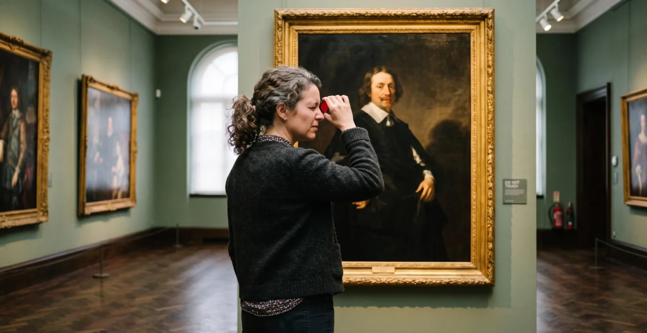
A painting rarely presents every element with equal visual urgency. Your attention may settle on a brightly illuminated face, move toward a raised hand, and then travel into a shadowed background. That experience is shaped partly by compositional design: the arrangement of visual weights, contrasts, edges, colors, and directional cues.
Skilled painters establish a visual hierarchy that makes certain elements easier to notice while encouraging relationships among them. The effect can feel effortless, even when the composition required considerable planning. A photograph or painting with the same subjects but different structural relationships may produce an entirely different viewing experience.
Composition does not give an artist absolute control over eye movements. Viewers bring their own interests, expectations, and perceptual habits. Nevertheless, understanding how visual attention responds to pictorial organization gives painters, photographers, and designers practical ways to make their intentions clearer.
The essential question is not simply where to place the focal point. It is how the entire arrangement supports that focal point, creates a meaningful sequence of discoveries, and keeps the viewer engaged with the image as a coherent whole.
Painting Composition: The Essential Principles
- Establish hierarchy: Use value contrast, edge quality, color, and scale to distinguish primary, secondary, and supporting elements.
- Design visual movement: Arrange masses, directional lines, and implied relationships to encourage attention to travel through the picture.
- Verify the structure: Test compositions at thumbnail size, compare alternative arrangements, and evaluate whether the visual sequence supports the intended effect.
- Why Do Symmetrical Compositions Feel Stable but Asymmetrical Layouts Create Visual Energy?
- How Do You Guide a Viewer’s Eye Through a Painting in a Specific Sequential Path?
- Rule of Thirds vs Golden Ratio: Which Compositional Grid Creates More Visually Satisfying Results?
- The Beginner Mistake That Makes Perfectly Painted Elements Fight for Attention
- Preliminary Sketches vs Intuitive Development: When to Plan Composition Before You Paint
- Why Do Compositions Using 1.618 Proportions Feel More Satisfying Than Random Arrangements?
- Why Do Unedited Photographs of Beautiful Landscapes Often Feel Visually Disappointing?
- What Geometric Principles Underpin Paintings That Feel Naturally Balanced and Complete?
Why Do Symmetrical Compositions Feel Stable but Asymmetrical Layouts Create Visual Energy?
Symmetrical compositions often feel stable because similar visual elements balance one another across an axis, making the arrangement relatively easy to understand. Asymmetrical compositions create energy by balancing different visual weights instead. Their unequal distribution invites comparison and exploration, giving artists more opportunities to establish a focal point and suggest subsequent directions for attention.
Imagine a portrait with its subject positioned directly on the vertical centerline, surrounded by equally weighted architectural features. The arrangement can communicate dignity, stillness, or ceremony. Its dominant relationships are immediately recognizable.
Now move the subject toward one side and introduce a contrasting window or architectural mass on the other. The viewer must consider how the unequal elements relate. That relationship can create tension without sacrificing balance.
The distinction is not simply symmetrical versus chaotic. According to the J. Paul Getty Museum‘s Principles of Design worksheet, visual balance concerns the distribution of weight among objects, colors, textures, and space. Both symmetrical and asymmetrical arrangements can achieve it.
Consider a hypothetical portrait exercise inspired by the dramatic lighting associated with Rembrandt. A largely centered figure establishes stability, while one strongly illuminated hand is positioned away from the central axis. The face may attract initial attention, but the displaced hand introduces a second destination.
Similarly, the architectural stillness associated with Edward Hopper offers a useful framework for exploring how one offset figure or window can complicate an otherwise orderly arrangement. These are compositional exercises, not claims that particular paintings necessarily followed this precise construction.
The appropriate arrangement depends on the desired experience:
| Decision criterion | Symmetry | Asymmetry |
|---|---|---|
| Dominant impression | Stillness, stability, formality | Movement, tension, discovery |
| Typical artistic use | Ceremonial portraits, monumental subjects, devotional imagery | Narrative scenes, expressive portraits, active landscapes |
| Focal organization | Often reinforces a central subject | Allows greater separation between visual elements |
| Primary challenge | Avoiding unnecessary rigidity | Balancing unequal masses without visual confusion |
Practical test: Squint at the composition or examine a strongly blurred version. If one side appears disproportionately heavy without serving the intended emotional effect, reconsider the distribution of dark shapes, bright areas, or saturated colors.
Balance provides the foundation, but hierarchy determines how attention moves within that balance. An asymmetrical arrangement becomes particularly effective when its unequal elements suggest a readable visual progression.
How Do You Guide a Viewer’s Eye Through a Painting in a Specific Sequential Path?
Guide the viewer’s eye by establishing a dominant focal area, arranging secondary attractions, and using visual connections to encourage movement between them. Value contrast, edge sharpness, saturation, scale, perspective, and implied lines can help create that sequence. These devices influence attention, but they cannot guarantee that every viewer will look at elements in an identical order.
Consider an interior painting containing three important elements: a brightly lit figure, an object held near the figure, and a distant doorway. The artist might create a first-second-third visual hierarchy by making the figure the strongest contrast, the object moderately prominent, and the doorway a quieter destination.
Different compositional tools contribute to that hierarchy in distinct ways:
- Value contrast: A bright shape against a dark field can become a conspicuous point of attention.
- Edge sharpness: Crisp boundaries can emphasize selected objects, especially beside softer transitions.
- Color saturation: A concentrated color accent can distinguish an element from a muted surrounding palette.
- Relative scale: A large figure or object may establish importance through its size.
- Implied lines: A figure’s gaze, pointing gesture, architectural alignment, or perspective convergence can suggest where to look next.
These cues interact rather than following a universal order of perceptual strength. A small, highly contrasting detail may overpower a large but muted object, while a face can attract attention because of its subject matter rather than its geometry alone.
A useful analysis exercise is to study a reproduction of a Vermeer interior or a Turner landscape. Record the first location that attracts attention, identify subsequent points of interest, and ask which pictorial relationships might explain those transitions.
Call this exercise a gaze trace. Mark the presumed entry point, draw arrows toward secondary attractions, and identify places where attention seems to approach the picture boundary. Then examine how contrasting masses, overlapping forms, or directional lines might encourage a return toward the interior.
This last step is sometimes called exit control. In studio practice, framing elements, inward-pointing diagonals, and repeated shapes can be used to discourage an unnecessarily abrupt outward movement. However, this is a design heuristic rather than proof that such devices reliably increase viewing time.
The distinction between guiding attention and controlling its exact sequence matters. In Beelders and Bergh’s eye-tracking study of landscape art, compositional organization helped direct viewers toward important elements, but their fixation order varied.
« The findings suggest that composition is successful in leading the eye, although the order of fixations can vary. »
The practical objective is therefore to make an intended route more inviting, not compulsory. If two elements compete equally through contrast, scale, and sharpness, different viewers may choose different starting points. This may be appropriate for an open-ended composition, but less helpful when the painting depends on a clear narrative priority.
A compelling visual sequence emerges when dominant and subordinate attractions work together. The next challenge is deciding whether geometric placement systems can make those relationships more reliable.
Rule of Thirds vs Golden Ratio: Which Compositional Grid Creates More Visually Satisfying Results?
Neither the rule of thirds nor the golden ratio has been established as universally superior for painting composition. The rule of thirds offers a fast, practical framework for placing important elements. Golden-ratio systems offer proportional relationships that can organize larger structures. The better choice depends on the composition’s purpose, complexity, and the artist’s ability to control visual hierarchy.
The rule of thirds divides the image into three equal sections horizontally and vertically. The resulting intersections provide convenient candidate positions for subjects, horizons, or major contrasts.
Its appeal is practical. During a rapid plein-air study or photographic framing exercise, the grid can help an artist avoid placing every important feature in the center without a clear reason.
The golden ratio, approximately 1.618, describes a relationship between two quantities. In a rectangle constructed according to this ratio, the longer side divided by the shorter side is approximately 1.618.
Golden-ratio-based construction can organize rectangular subdivisions, intervals, and relationships among masses. Its value as a compositional tool is broader than simply placing a subject along a golden spiral.
| Criterion | Rule of thirds | Golden-ratio systems |
|---|---|---|
| Primary function | Quick positional guidance | Proportional organization |
| Complexity | Low | Moderate to high |
| Useful applications | Photography, thumbnails, rapid painting | Deliberate geometric studies and complex layouts |
| Main limitation | Can encourage formulaic placement | Can encourage excessive geometric interpretation |
| Aesthetic superiority | Not universally established | Not universally established |
Research provides some evidence that golden-ratio proportions can influence preference, but it does not justify treating the ratio as an automatic formula for beauty.
53%
Overall preference for golden-ratio proportions in comparisons reported by an experimental study involving 256 participants. Preferences varied by stimulus category, and this was not a direct comparison with the rule of thirds.
The experimental study published in PsyCh Journal on golden-ratio preferences, first published in 2021.
In that research, golden-ratio proportions were preferred in 55% of comparisons involving painting stimuli, while the corresponding result for geometric shapes was 48% and did not show a statistically significant preference. The study’s findings were therefore dependent on the type of stimulus.
For a more productive studio comparison, create three versions of the same subject: one using thirds, one using a golden-ratio construction, and one developed without either grid. Preserve the subject and approximate value structure while adjusting the spatial relationships.
Evaluate whether the focal point remains clear, whether supporting elements feel connected, and whether the composition stays engaging at different viewing distances. Historical paintings can also be analyzed for nested rectangles or recurring intervals without assuming they were designed using one specific grid.
Geometric structure is most useful when it reinforces hierarchy. Even a mathematically elegant arrangement can fail if every object demands the same amount of attention.
The Beginner Mistake That Makes Perfectly Painted Elements Fight for Attention
A common beginner mistake is giving every element equal visual emphasis. When foreground objects, background details, textures, and edges receive similar contrast and precision, the painting loses a clear attention hierarchy. Individual passages may be beautifully rendered, yet the complete image becomes difficult to read because nothing is sufficiently subordinate to the intended focal point.
This problem often appears when an artist treats each object as an independent demonstration of painting ability. Every leaf receives a sharp contour. Every stone contains high contrast. Every distant building is rendered with the same precision as the foreground subject.
The result is a collection of competing attractions rather than an organized picture.
Selective simplification offers the counterintuitive solution. An artist may reserve sharper edges, finer detail, and stronger accents for the primary subject while deliberately reducing competing information elsewhere.
This does not mean the surrounding areas are carelessly painted. A restrained background can require considerable judgment because its shapes and values must support the subject without becoming distracting.
Consider a hypothetical still life containing a glass bottle, a folded cloth, and several pieces of fruit. If every reflection, fabric crease, and fruit highlight receives identical emphasis, the viewer may struggle to identify the intended subject.
Instead, choose the bottle as the principal attraction. Give its silhouette a clear value contrast, preserve selected crisp reflections, and soften less important cloth folds. The fruit can remain convincing while contributing quieter shapes and colors.
One useful diagnostic is to shrink the image until it resembles a postage stamp. Then desaturate it to evaluate the large value relationships.
If the focal point disappears, the apparent emphasis may depend too heavily on small details. This thumbnail test is a studio heuristic, not a substitute for observing actual viewers.
Excessive detail can also create an impression of visual busyness. However, whether it measurably fatigues viewers or reduces engagement duration depends on conditions that cannot be established merely by inspecting the composition.
The important principle is that finish should serve hierarchy. A deliberately quiet passage can make the most carefully painted passage more effective.
Once the hierarchy is clear, the artist can decide how much of it should be established in advance and how much can emerge through the painting process itself.
Preliminary Sketches vs Intuitive Development: When to Plan Composition Before You Paint
Plan composition before painting when the final effect depends on precise relationships among large shapes, focal points, and directional cues. Work more intuitively when the painting depends on discoveries made through gesture, color, and changing visual relationships. For many artists, a hybrid approach works well: establish the main structure in preliminary sketches, then allow controlled improvisation during execution.
A complex multi-figure narrative may depend on the placement of several interrelated masses. Moving one figure changes the negative spaces, implied directions, and visual balance elsewhere in the image.
Such compositions often benefit from preparation because major structural problems become more difficult to correct after substantial painting has begun.
By contrast, a gestural abstract painting may develop through successive responses to color, movement, and emerging shapes. Overly rigid planning could prevent the artist from discovering its most effective relationships.
The distinction is not between disciplined artists and spontaneous artists. It concerns which decisions must remain stable and which can productively evolve.
Preliminary composition is also a documented historical technique. The National Gallery‘s glossary entry on underdrawing describes preliminary outlines made on a prepared support that guide subsequent paint application.
Underdrawing is one form of preparation, although it does not demonstrate that every painter followed the same workflow or that planning invariably produces superior art.
A practical hybrid workflow begins with small monochromatic sketches. Each thumbnail explores the distribution of dominant lights, darks, and intermediate values without committing to surface detail.
Choose the arrangement that best supports the intended attention hierarchy. Transfer its essential masses to the working surface, then remain flexible about color relationships, expressive edges, and unexpected marks.
Experienced painters may make these structural judgments quickly because they have practiced recognizing compositional relationships. For beginners, explicit planning can make those judgments easier to inspect and discuss rather than relying entirely on intuition.
A Five-Step Composition Planning Checklist
- Identify the visual priority: Write one sentence naming the primary focal subject and the intended emotional effect. Deliverable: a clear composition objective.
- Generate three value thumbnails: Rearrange the major light and dark masses in three small sketches. Deliverable: three distinct compositional alternatives.
- Map the attention sequence: Mark the intended first, second, and third areas of interest on the strongest thumbnail. Deliverable: one annotated gaze-path sketch.
- Check hierarchy at reduced size: Shrink or blur the selected arrangement and adjust competing accents. Deliverable: a revised thumbnail with a recognizable focal area.
- Compare the underpainting with the plan: Inspect major masses, directional cues, and boundaries before adding detail. Deliverable: an underpainting approved for further development or marked for correction.
Whether the composition began with detailed sketches or intuitive marks, the same final questions remain relevant: where does attention settle, what encourages exploration, and do the large shapes support the painting’s purpose?
Planning establishes relationships, yet it does not determine which proportions are aesthetically convincing. That question requires distinguishing useful geometric organization from claims about mathematical beauty.
Why Do Compositions Using 1.618 Proportions Feel More Satisfying Than Random Arrangements?
Golden-ratio compositions may feel satisfying when their proportions create coherent relationships among major and minor shapes. Repeated intervals can help viewers perceive an organized whole rather than disconnected parts. However, the claim that 1.618 is inherently more beautiful than other ratios remains scientifically unsettled. Proportional coherence is a useful design principle; the golden ratio is only one possible way to explore it.
The golden ratio can generate nested rectangles with recurring proportional relationships. This makes it attractive to artists interested in coordinating large structural divisions with smaller internal spaces.
Imagine a hypothetical painting divided into one dominant rectangular mass and a smaller adjoining area. The larger region contains a second arrangement whose proportions echo the relationship between the original divisions.
The viewer encounters repetition without exact duplication: different shapes belong to a recognizable structural family.
Compare this with an arrangement in which the major forms have unrelated proportions, inconsistent spacing, and no deliberate hierarchy. The latter may appear unsettled if those differences do not support an artistic intention.
But randomness and deliberate asymmetry are not the same. An irregular arrangement can be expressive, coherent, and highly successful.
Proportional echo is the more general concept. Relationships among the divisions of a painting can establish unity even when those relationships do not correspond to the golden ratio.
The experimental findings discussed earlier support only a qualified interpretation. The preference for golden-ratio proportions reported in PsyCh Journal was modest and varied across stimulus categories. A smaller eye-tracking experiment involving 15 participants also explored viewing behavior, but its findings do not establish that nested golden rectangles cause easier visual processing or longer engagement.
To examine proportion constructively, select paintings by Georges Seurat, Piet Mondrian, or Renaissance artists and measure recurring intervals among major shapes. Record where relationships repeat and where they change.
Do not assume that identifying a ratio proves the artist used it intentionally. A grid imposed after a painting is complete can often be adjusted until some of its lines coincide with recognizable elements.
That is the central risk of retrospective golden-ratio analysis: geometric coincidence is not evidence of deliberate construction.
For a fair studio test, design one arrangement using a golden-ratio system and another using a different consistent proportional scheme. Compare their focal clarity, internal relationships, and expressive effectiveness without assuming the result in advance.
The larger lesson extends beyond geometry: an image becomes convincing when its relationships support a unified experience. This is particularly apparent when comparing carefully edited paintings with photographs that record a scene without deliberate compositional refinement.
Why Do Unedited Photographs of Beautiful Landscapes Often Feel Visually Disappointing?
Unedited landscape photographs can feel disappointing because the camera records a scene without automatically reproducing the photographer’s experience of its visual hierarchy. A striking landscape may contain atmospheric depth, subtle light, and a compelling subject, yet the resulting image can lack a clear focal point. Painters and photographers improve such images through deliberate selection, value grouping, and emphasis.
Standing before a landscape, a person may be especially conscious of a sunlit mountain, a distant valley, or a dramatic opening in the clouds. Attention is selective, and the experience unfolds through observation.
A photograph instead presents a bounded image with a particular exposure, perspective, depth of field, and distribution of detail. The qualities that felt extraordinary in person may occupy only a small or visually undistinguished part of the frame.
Two common compositional problems explain many disappointing results.
The first is weak separation of visual masses. Under flat illumination, foreground, middle ground, and distant elements may have similar values. Without sufficient distinction, the primary subject can become difficult to recognize.
The second is undifferentiated detail. Grass, foliage, rocks, buildings, and mountains may all contribute equally prominent textures, especially when photographed with considerable depth of field.
These problems are not inevitable properties of photography. Photographers can control attention through lens choice, viewpoint, exposure, framing, lighting, depth of field, and editing.
Likewise, paintings do not automatically achieve better hierarchy. The advantage comes from purposeful decisions rather than the medium itself.
Landscape painters frequently simplify observed information through grouped values, selective edges, and atmospheric perspective. More distant elements may be rendered with reduced contrast and less distinct boundaries to reinforce spatial depth.
Studio Exercise: Restructuring a Flat Landscape Photograph
In this hypothetical exercise, a photograph shows a mountain, a lake, and detailed vegetation. The lighting is diffuse, the horizon bisects the frame, and the foreground competes with the mountain for attention.
First, identify the mountain as the intended focal subject. Then group foreground vegetation into fewer dark masses, adjust the distribution of sky and land, and reduce unnecessary detail in secondary areas.
Finally, create a monochrome study that gives the mountain a clearer value relationship with its surroundings. The intended result is a more coherent composition, not a claim that the edited version will be preferred by every viewer.
Observing nature and interpreting nature are different artistic tasks. A painter working directly from a landscape can legitimately move a tree, suppress a distracting branch, or modify a value relationship to create a clearer image.
A photographer may achieve comparable emphasis through a revised viewpoint, careful cropping, or tonal adjustments. Both approaches depend on identifying the essential visual experience and organizing the image accordingly.
Viewers familiar with photography may also bring expectations about realism and visual detail when looking at paintings. Those expectations can shape interpretation, although they do not establish that paintings resembling unedited photographs necessarily produce disappointment.
Once unnecessary information has been reduced, the remaining challenge is structural unity: making shapes, intervals, focal areas, and directional relationships feel as though they belong together.
Key Takeaways Before Your Final Composition Review
- Balance is relational: A successful arrangement need not be symmetrical, but its contrasting visual weights should serve the intended effect.
- Proportion is a tool, not a verdict: Recurring intervals and coherent relationships matter more than forcing an entire painting to conform to one numerical formula.
- Evaluate the whole image: An effective composition coordinates focal hierarchy, movement, supporting masses, and boundary relationships instead of optimizing isolated elements.
What Geometric Principles Underpin Paintings That Feel Naturally Balanced and Complete?
Paintings often feel balanced and complete when their major shapes, axes, intervals, and directional relationships form a coherent visual structure. Geometric armatures, diagonals, repeated proportions, and distributed visual weight can help establish that structure. Yet mathematical regularity does not guarantee artistic success. The relevant standard is whether the arrangement supports the painting’s intended emphasis, movement, and emotional character.
A compositional armature is an underlying organizational framework. It can help connect focal points, major masses, and structural divisions without requiring the finished image to display a visible grid.
Several geometric approaches are useful to distinguish:
- Diagonal armatures: Diagonal relationships can organize opposing directions, major divisions, and visual movement across the picture.
- Rabattement: In rectangular composition, this construction identifies a square derived from the shorter side, offering a framework for organizing internal relationships.
- Dynamic symmetry: A geometric approach that uses proportional rectangles and related diagonals to establish spatial relationships.
- Axis relationships: Vertical, horizontal, and diagonal alignments can create stability, opposition, or connections among subjects.
- Interval repetition: Recurring relationships among distances, shapes, and proportions can help unify separate parts of the composition.
These systems should be treated as alternative construction tools, not as interchangeable names for a single geometric formula.
Unity also differs from uniformity. Three identical objects placed at equal intervals may create an orderly arrangement, but the effect can become mechanical if repetition offers no variation.
More subtle relationships can produce coherence without obvious duplication. A broad dark shape might be echoed by a narrower shadow elsewhere; a diagonal in the foreground may reappear in a distant roofline at a different scale.
Such relationships can make an image feel integrated while preserving movement and surprise.
For a final studio review, examine the painting through four connected questions:
- Weight distribution: Do the main light, dark, large, and saturated masses support the intended balance?
- Gaze sequence: Is the primary attraction recognizable, and are there meaningful secondary areas to explore?
- Interval relationships: Do major shapes and spaces create useful proportional or directional connections?
- Exit control: Do important lines and boundary relationships support exploration of the picture rather than producing unintended distractions?
These four checks are a practical teaching framework rather than an experimentally validated universal scoring system. Their value comes from making compositional decisions observable and revisable.
The limit case is an intentionally unstable composition. An expressive painting may place a figure uncomfortably close to the edge, interrupt a dominant axis, or leave one area visually much heavier than another.
Those decisions are not automatically errors. If they reinforce isolation, urgency, unease, or another deliberate effect, the apparent imbalance may be essential to the work.
Compositional completeness means coherence with artistic intention, not perfect symmetry or mathematical conformity.
A useful final test is to remove the visible grid, stop looking at individual technical devices, and judge the entire image. Does the painting communicate its intended experience without requiring the viewer to understand how it was constructed?
For the next painting or photographic study, create two small variations with different focal hierarchies, trace the visual movement through each, and compare their effectiveness at reduced size. Keep the version whose overall structure best supports the experience you want the viewer to have.
Can an artist control exactly where every viewer looks first?
No. Artists can influence attention through contrast, scale, color, edge quality, and directional cues, but viewers do not necessarily follow identical fixation sequences. Eye-tracking research by Beelders and Bergh indicates that composition can direct attention toward salient elements while leaving variation in the order of gaze movements.
Does the focal point always need to be the brightest area?
No. Brightness is only one source of visual emphasis. A dark silhouette against a light background, a sharply defined face among soft shapes, or a small saturated accent can become the focal point. The important relationship is contrast with surrounding elements, not absolute brightness.
How many focal points should a painting contain?
There is no universal number. A painting can contain one dominant focal area and several secondary attractions, while a complex narrative may require multiple important centers. Establishing differences in emphasis can make these elements easier to interpret as parts of a deliberate visual hierarchy.
Is it necessary to draw a geometric grid before painting?
No. Grids can be useful for organizing proportions and testing alternative arrangements, but successful composition also depends on value, scale, edges, subject matter, and artistic intention. A small value thumbnail may reveal important structural problems without requiring a formal geometric system.
What is the quickest way to check whether a composition works?
Reduce the image to thumbnail size and temporarily remove color. Identify the most prominent mass, the intended focal area, and any competing contrasts. Then examine the original image to see how edges, saturation, and directional cues affect the reading. This practical diagnostic is especially useful during preliminary composition studies.