
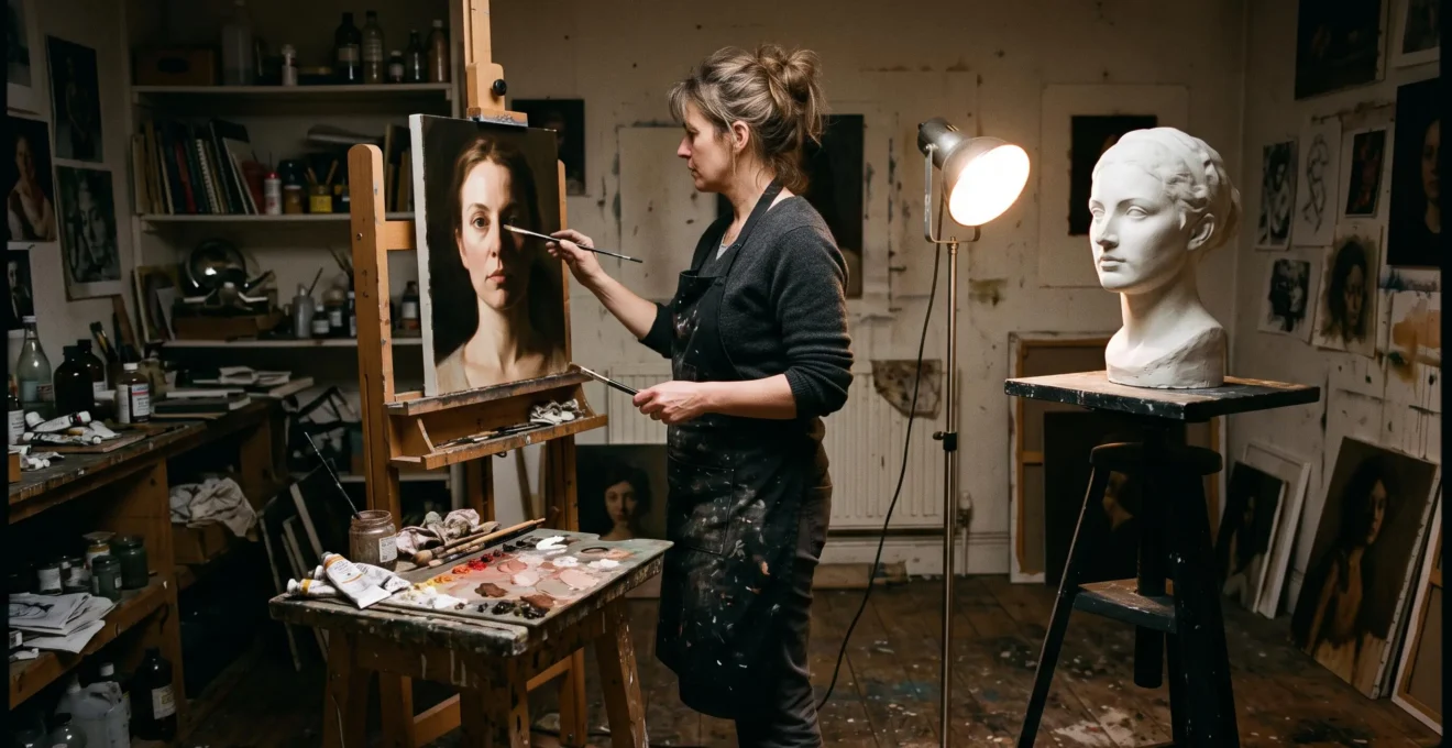
A painted face can possess accurate proportions, convincing skin colours and meticulously observed features yet still resemble a flat mask. The missing element is often not drawing accuracy but the organisation of light and shadow. Tonal contrast creates the illusion of volume by showing how surfaces turn towards, away from and occasionally block a light source.
On a flat canvas, paint cannot reproduce the physical depth of a cheekbone or the recession beneath a jaw. Instead, the painter establishes relationships between illuminated planes, transitional halftones, form shadows and cast shadows. When those relationships follow a coherent lighting structure, the viewer interprets patches of pigment as solid, three-dimensional forms.
This is the central discipline of chiaroscuro, developed with extraordinary expressive variety by painters including Leonardo da Vinci, Caravaggio and Rembrandt. Their approaches demonstrate that darkness is not merely an absence of detail: it can describe anatomy, establish space and direct attention.
For figurative and portrait painters, mastering this principle begins with controlling a few decisive value relationships before attempting subtle blending or intricate colour variations.
Chiaroscuro: the essential principles
- Structure creates solidity: Light and shadow must correspond to the direction and orientation of each painted surface.
- Five values provide a practical starting point: Separate full light, halftone, core shadow, reflected light and cast shadow before refining transitions.
- Contrast controls expression and attention: The position, sharpness and range of tonal differences influence both perceived depth and narrative emphasis.
- Why Do Paintings With Harsh Light-Dark Contrasts Feel More Emotionally Intense?
- How Do You Map Light Across a Face Using Only Five Tonal Steps?
- Single Spotlight vs Ambient Lighting: Which Creates Baroque Drama Versus Renaissance Clarity?
- The Shadow Placement Mistake That Makes Perfectly Drawn Faces Look Flat
- The Beginner Strategy: When to Ignore Subtle Light Variations and Paint Only Major Zones
- Why Do Paintings With Perfect Colour but Wrong Values Look Flat and Unconvincing?
- How Do You Distinguish Leonardo’s Sfumato From Caravaggio’s Tenebrism Without Reading Labels?
- How Do Paintings Control Where You Look First, Second, and Third Through Compositional Design?
Why Do Paintings With Harsh Light-Dark Contrasts Feel More Emotionally Intense?
Paintings with harsh light-dark contrasts often feel emotionally intense because bright forms emerge abruptly from surrounding darkness, concentrating visual attention and heightening the apparent significance of gestures and expressions. Strong tonal boundaries make illuminated features conspicuous, while concealed surroundings create uncertainty. The resulting drama depends on contrast organisation, not simply on making shadows darker.
The visual system is sensitive to changes in luminance. An abrupt transition between adjacent values produces a conspicuous boundary, helping the eye distinguish one region from another. Painters exploit this sensitivity when illuminating a face against a nearly black background or placing a brightly lit hand beside dark fabric.
Caravaggio’s The Denial of Saint Peter, painted in 1610, demonstrates this theatrical economy. The Metropolitan Museum’s collection record for The Denial of Saint Peter associates the dramatic effect of Caravaggio’s late work with brightly illuminated areas contrasted against nearly black backgrounds. In the painting, the encounter between Peter, an accusing woman and a soldier becomes urgent through concentrated gestures and illumination.
However, emotional intensity and convincing physical depth are not identical achievements. A striking silhouette against darkness may attract attention without explaining how the subject’s nose, forehead or cheek turns in space. Sculptural depth additionally requires organised internal value transitions.
Consider a hypothetical portrait with a pale face on a black ground. If both cheeks receive the same brightness despite facing different directions, the contrast may feel theatrical while the features remain flat. Modelling the planes according to a consistent light source changes the result from a dramatic cutout into a believable head.
The distinction between Renaissance restraint and Baroque theatricality is also more nuanced than a simple progression from soft to harsh contrast. Renaissance painters could employ pronounced darkness, while Baroque artists varied their transitions for different expressive purposes.
What matters is the relationship between the brightest lights, darkest shadows and the edges connecting them. Adding black indiscriminately reduces information; controlling which information emerges from darkness creates drama.
Once dramatic emphasis has been separated from structural modelling, the next task is to establish a reliable tonal map across the features themselves.
How Do You Map Light Across a Face Using Only Five Tonal Steps?
Map a face using five tonal steps by separating full light, halftone, core shadow, reflected light and cast shadow into clearly distinguishable value groups. Each group describes a different lighting condition on the facial structure. This simplified portrait method makes the turning planes readable before subtle blending complicates their relationships.
Begin with a stationary head and one directional lamp. Observe the forehead, cheekbones, temples, nose, eye sockets and jaw as connected surfaces rather than as isolated features. Their values change according to how they face the light, whether another form obstructs the illumination and whether light is reflected into the shadows.
The following five-part map is a practical studio exercise, not a universal anatomical formula:
- Full light: Place the highest sustained light value on planes strongly facing the source, such as the illuminated forehead or cheek. Reserve smaller highlights for particularly reflective areas.
- Halftone: Use an intermediate light-family value on planes beginning to turn away, commonly around the side of the forehead, cheek or rounded chin.
- Core shadow: Establish a darker band on curved surfaces that have turned away from direct illumination. Its position depends on facial geometry and lighting direction.
- Reflected light: Introduce restrained illumination within the shadow family, such as light bouncing from clothing or nearby surfaces onto the underside of the jaw.
- Cast shadow: Identify areas where one feature blocks light from another, including shadows beneath the nose, under the brow or below the chin.
These categories describe different physical phenomena rather than five universally fixed brightness levels. Reflected light and cast shadows can vary according to the surrounding environment. For this exercise, keep reflected light visibly subordinate to the main light family and maintain distinct shadow shapes.
The J. Paul Getty Trust‘s Exploring Value to Create Form worksheet explains how changes in lightness and darkness create the illusion of three-dimensional form. Its instructional material identifies highlights, core shadows, reflected light and cast shadows, although it uses a ten-step scale rather than prescribing this five-part portrait system.
To test the portrait, squint until minor details disappear. The forehead should still turn convincingly into the temple, the nose should project from the facial plane and the jaw should recede beneath the chin. A grayscale photograph can provide another useful check, revealing whether colour differences are disguising poorly separated values.
If two intended zones merge, first determine whether their separation is necessary for describing form. Some neighbouring regions should connect into one larger value mass; others need a clearer distinction to reveal a change of plane.
The five-step approach is a training scaffold. Finished portraits may contain continuous transitions, delicate highlights and complex reflected colours. The initial map provides a structure within which those refinements can operate.
With the major planes established, the painter must decide what kind of illumination will govern the entire scene: concentrated directional light or a broader ambient arrangement.
Single Spotlight vs Ambient Lighting: Which Creates Baroque Drama Versus Renaissance Clarity?
A single directional spotlight is generally better suited to concentrated Baroque-style drama, while broad ambient illumination often supports the evenly readable forms associated with Renaissance clarity. Directional light establishes conspicuous highlights, coherent shadow masses and strong spatial emphasis. Ambient light softens transitions and can make several figures simultaneously legible. Neither system belongs exclusively to one historical period.
A directional source gives the painter a clear organisational principle. Every exposed surface faces towards, sideways to or away from a dominant illumination direction. Cast shadows reveal which forms obstruct that light, while connected dark areas may subordinate entire sections of the composition.
Ambient illumination behaves differently. Light scattered from windows, walls and surrounding objects can reach surfaces from several directions. The resulting values are generally less sharply separated, although actual edge softness also depends on the apparent size and position of the light sources.
These systems offer different practical advantages.
| Decision | Single directional spotlight | Broad ambient lighting |
|---|---|---|
| Expressive emphasis | Concentrated drama and selective revelation | Continuity, balance and broader legibility |
| Light-shadow design | Dominant shadow masses and a clear lighting direction | Gradual transitions and several illuminated planes |
| Suitable subject | A decisive gesture, isolated figure or focal action | Multiple figures, complex arrangements or serene scenes |
| Initial workflow | Establish the large shadow pattern before details | Compare values across the whole canvas before local modelling |
| Principal risk | Crushed shadows that hide essential structure | Weak tonal hierarchy and competing focal areas |
For a hypothetical Baroque-inspired portrait, place a stationary lamp above and to one side of the sitter. Draw the complete illuminated silhouette and the principal shadow shapes before mixing subtle flesh tones. This prevents individual features from acquiring incompatible lighting.
For a quieter multi-figure composition, establish the relative brightness of all figures together. Ambient modelling permits gentler transitions, but the painter still needs an intentional hierarchy of light and dark across the canvas.
Historical examples resist rigid classification. Leonardo’s The Virgin of the Rocks combines illuminated figures with a dark surrounding environment and exceptionally soft transitions. Thus, strong contrast does not automatically imply a Baroque lighting system, and softness does not require the absence of darkness.
The crucial requirement is consistency within the chosen illumination. Mixing directional and ambient light deliberately can work; accidentally reversing light direction between a nose, hand and shoulder weakens their apparent coexistence in space.
Once a coherent source has been chosen, convincing modelling depends less on adding tonal effects than on placing the boundary between light and shadow correctly.
The Shadow Placement Mistake That Makes Perfectly Drawn Faces Look Flat
A correctly drawn face often looks flat when its shadows follow visible outlines instead of the orientation of its underlying planes. The decisive error is treating darkness as decorative shading rather than evidence of light interacting with three-dimensional structure. Misplaced light-shadow boundaries can weaken the turning of the forehead, cheek or jaw despite accurate proportions.
Imagine a portrait in which the nose is carefully outlined but receives identical illumination across both sides. A dark mark beneath its tip may suggest a nostril, yet the bridge does not project convincingly because the broad planes have not been distinguished.
The essential structural boundary is the terminator, where direct illumination ends on a curved form. It is not necessarily a sharp painted line. Its position and apparent softness depend on the shape of the surface, the characteristics of the illumination and the local light environment.
The core shadow often develops near this transition, where the surface receives little direct light. When the painter moves or blurs this boundary without considering the geometry of the head, the cheek can lose its curvature and the forehead may appear unnaturally flat.
Correct the problem by identifying the largest shadow family before drawing smaller marks within it. For a sitter illuminated from the upper left, establish the main shadow on the turning side of the head, then locate shadows cast by the nose, brow and chin separately. Form shadows describe surfaces turning away; cast shadows indicate that another surface blocks the light.
Reflected light presents another frequent problem. A bright reflected patch beneath the jaw can be attractive, but if it competes with the illuminated cheek, the shadow no longer reads as subordinate. The painter may have represented an observable bounce of light while destroying the clarity of the larger value pattern.
A useful correction is to temporarily cover the reflected-light passage with a darker mixture. If the head immediately appears more solid, restore only as much reflected illumination as the structural relationship permits.
Observe the head with narrowed eyes throughout this process. The purpose is not to eliminate complexity but to ensure that each variation strengthens an already comprehensible surface.
Reliable shadow placement becomes easier when minor variations are deliberately suppressed until the largest relationships are secure.
The Beginner Strategy: When to Ignore Subtle Light Variations and Paint Only Major Zones
Beginners should ignore subtle light variations during the first painting pass, especially when the major illuminated and shadowed masses are not yet convincing. Reducing the subject to three to five broad tonal zones makes structural errors easier to recognise and correct. Fine gradations become useful only after the simplified arrangement already communicates volume.
The eye can recognise the basic solidity of a head from a limited pattern of connected lights and shadows. At a distance, tiny changes in value become less apparent, while the larger distribution of brightness remains visible. This makes simplification a practical way to test whether the painting’s primary structure works.
Begin by selecting a stable light source and a limited range of mixtures. In the first pass, separate the principal light family from the principal shadow family. Subdivide only where a change of plane is essential: for example, the front of the forehead turning towards the temple or the chin separating from the neck.
In the second pass, adjust the halftones so that they connect the lighted planes without destroying the original value hierarchy. Introduce restrained reflected light and refine selected edges. Small features, skin variations and surface texture can follow later.
The following checklist provides a repeatable studio exercise. Its value lies in making each decision observable rather than attempting full rendering immediately.
Five actions for building a solid portrait study
- Fix one lighting direction. Position a lamp and make a small arrow sketch recording where the light originates. Deliverable: one annotated lighting-direction thumbnail.
- Identify three major masses. Reduce the reference to a light family, a transitional region and a shadow family. Deliverable: a three-value thumbnail with no facial details.
- Expand to five tonal categories. Mark full light, halftone, core shadow, reflected light and cast shadow on the study. Deliverable: a labelled value map.
- Test the shadow structure. Squint at the canvas or examine a grayscale photograph, then correct any confusing light-shadow divisions. Deliverable: a revised study with a coherent major shadow shape.
- Refine only established planes. Add selected halftones and softened edges while preserving the main value masses. Deliverable: a second-pass portrait that remains readable at arm’s length.
The warning sign that simplification has lasted too long is a portrait that resembles a poster: zones have the correct general arrangement but no convincing variation where rounded surfaces gradually turn.
At that stage, introduce transitions selectively. Soften the cheek where its curvature requires a gradual change, but retain a firmer boundary beneath an overlapping form if the observed lighting supports it. Edge quality should describe structure, not merely make the painting smoother.
Even with a correct sequence of painting decisions, the illusion can still fail when attractive colours conceal weak differences in lightness and darkness.
Why Do Paintings With Perfect Colour but Wrong Values Look Flat and Unconvincing?
A painting can reproduce accurate colours yet look flat because colour matching does not guarantee a coherent distribution of light and dark. Tonal values provide essential information about illumination, turning planes and overlapping forms. When neighbouring surfaces receive inappropriate values, their three-dimensional relationships become ambiguous even if their hues closely resemble the subject.
Value describes relative lightness or darkness; hue identifies a colour family. A painter might correctly identify the reddish colour of an illuminated cheek and the cooler colour of a shadowed cheek while assigning both mixtures nearly identical lightness. Their colour distinction survives, but the expected turn from light into shadow is weakened.
This is particularly noticeable when working from saturated digital references. Strong colour differences can make neighbouring regions appear distinct on a screen even when their underlying luminance relationships are poorly organised.
A practical diagnostic is to photograph the painting under reasonably even illumination and examine a grayscale version. Look for a clear distinction between the illuminated forehead and the turning temple, between the front of the nose and its shadowed side, and between the chin and the neck beneath it.
If these forms lose their separation in grayscale, the value map deserves examination. However, grayscale is a diagnostic tool rather than a complete account of colour perception. Hue and saturation can also influence apparent boundaries, spatial effects and visual emphasis.
Rembrandt’s Lucretia offers an instructive example of tonal structure combined with chromatic richness. The National Gallery of Art‘s scholarly analysis documents varied colours and applications in the face, including different treatments of illuminated and shaded passages. Those colour decisions operate within a carefully organised lighting scheme rather than replacing it.
In studio practice, this suggests a productive division of labour. First establish sufficient value separation to describe the form. Then vary temperature, hue and surface texture within those relationships. A cool reflected light may become chromatically complex without needing to rival the main highlight in brightness.
Repainting a weak passage with increasingly accurate colour rarely corrects the underlying problem if the light direction and value relationships remain unchanged. Conversely, reducing a chromatically rich painting to an indiscriminate grayscale formula can sacrifice expressive qualities that colour contributes independently.
The objective is not colourlessness. It is a partnership in which tonal organisation supports structure while colour develops material, atmosphere and expression.
With this distinction established, historical painting techniques become easier to recognise as different approaches to controlling not only darkness and brightness but also the transitions between them.
How Do You Distinguish Leonardo’s Sfumato From Caravaggio’s Tenebrism Without Reading Labels?
Leonardo’s sfumato is recognisable through exceptionally subtle tonal transitions and softened contours, while Caravaggio’s tenebrism is associated with dramatic illuminated forms emerging from extensive darkness. Sfumato primarily concerns the handling of transitions; tenebrism concerns the dominant contrast and distribution of light and shadow. Both can create depth, but they organise visual experience differently.
To recognise sfumato, examine the boundaries around a painted face. Instead of a conspicuous line separating cheek from background or light from shade, look for a gradual transition that allows the surface to turn almost imperceptibly.
Leonardo’s Virgin of the Rocks provides a particularly revealing example. The National Gallery’s analysis of Leonardo’s Virgin of the Rocks discusses fine, smoky tonal gradations around facial features, including the Virgin’s temples and nose. These transitions contribute to the three-dimensional appearance of the figures.
For tenebrism, broaden the observation from individual edges to the entire composition. Are substantial areas absorbed into darkness? Do illuminated bodies or gestures emerge selectively from that surrounding field? Does shadow itself govern what remains visible?
Caravaggio’s The Denial of Saint Peter demonstrates how concentrated brightness against near-black surroundings can serve a tense narrative. The darkness does more than shade individual forms; it limits the visible environment and concentrates attention on the encounter.
Tenebrism should therefore not be confused with all chiaroscuro. Chiaroscuro describes modelling and expression through light-dark relationships; tenebrism uses particularly dominant darkness as a compositional and dramatic strategy.
The lighting distinction is helpful but not absolute. Sfumato is compatible with gradual, enveloping light, yet soft transitions can also occur under directional illumination. Likewise, a painting may contain emphatic global contrasts while retaining carefully softened transitions within its illuminated figures.
The painter’s expressive choice follows from this distinction. Gradual transitions can encourage sustained attention to minute facial changes and subtle modelling. Concentrated illumination can make a gesture feel like an isolated event within a larger field of darkness.
Neither approach guarantees a particular emotional reaction. Subject, pose, composition, colour and the viewer’s interpretation remain important.
The final decision extends beyond modelling one figure: it concerns how the painter distributes contrast to organise the viewer’s attention across the entire canvas.
Key takeaways before composing the final image
- Reserve the clearest value emphasis for the subject or action that carries the painting’s principal meaning.
- Use subordinate light accents and selective edges to support a viewing sequence rather than allowing every object to compete equally.
- Evaluate the whole canvas at a reduced scale before refining individual features, because a convincing portrait can still belong to an unfocused composition.
How Do Paintings Control Where You Look First, Second, and Third Through Compositional Design?
Paintings can guide visual attention by arranging tonal contrasts, edges, illuminated subjects and directional forms into a hierarchy. Strong light-dark opposition can establish a focal point, while smaller contrasts suggest secondary areas of interest. A deliberate sequence encourages viewers to explore the composition in a meaningful order, although individual viewing paths are never completely predictable.
A painter designing a dramatic scene must distinguish local modelling from global visual organisation. The contrast needed to make one cheek look solid may be modest; the contrast required to distinguish the protagonist from surrounding figures may be much stronger.
In Lucretia (1664), Rembrandt uses selective directional illumination to reinforce the psychological tension of the scene. The National Gallery of Art’s scholarly catalogue describes how light falling on the figure’s head, arm and shoulder, together with accents on the hand and dagger, animates an essentially static pose.
This demonstrates an important compositional principle: illuminated passages do not need to occupy the entire painting to carry its emotional meaning. Carefully selected accents can establish relationships between the figure, the gesture and an important object.
For a hypothetical three-figure scene, the painter might plan the following sequence:
- First attention: Place the most conspicuous value contrast around the central figure’s face, where the principal emotion is communicated.
- Second attention: Give an interacting hand a smaller light accent or a distinct edge that connects it visually to the facial expression.
- Third attention: Reveal a background figure with a more restrained tonal difference, allowing the broader narrative to emerge without challenging the primary focus.
This order is an intended compositional path, not a guaranteed prediction of eye movements. Size, colour saturation, familiar objects, faces and the viewer’s prior interests can all compete with tonal contrast.
Nevertheless, the hierarchy provides a useful practical framework. A brightly painted incidental object can accidentally overpower the intended protagonist. Similarly, too many sharply defined edges can distribute attention evenly instead of guiding it.
To audit a composition, stand back or reduce the image to thumbnail size. Squint and note the first three regions that attract attention. Compare that observation with the intended narrative sequence. If an unimportant region dominates, consider reducing its contrast, softening an edge or adjusting its relative brightness before refining more detail.
Strong composition also requires connected shadow shapes. Darkness can unify a background and allow the viewer to move between illuminated elements without having to interpret every intervening object.
The goal is controlled visual emphasis rather than maximum contrast everywhere. A painting gains depth and clarity when its structural lighting, expressive intensity and compositional hierarchy reinforce one another.
For the next painting, make a small monochrome compositional study before developing colour or detail. Identify the intended first, second and third points of attention, establish their relative value emphasis, then test whether those decisions remain clear when the study is viewed from a distance.
Can convincing chiaroscuro be painted without using pure black?
Yes. Chiaroscuro depends on relative light-dark relationships rather than the obligatory use of pure black. Dark mixtures made from coloured pigments can establish convincing shadows if they remain appropriately separated from the illuminated planes. The necessary darkness depends on the lighting and the intended expression.
Should a portrait painter soften every transition to make the face look round?
No. Rounded surfaces often require gradual transitions, but cast shadows, overlapping forms and some changes in plane need more distinct edges. Uniform softness can obscure structure just as excessive sharpness can fragment it. Edge treatment should follow the observed geometry and lighting.
Does a five-value study need five equally spaced shades of grey?
No. A five-value portrait exercise groups different lighting conditions for training purposes. Those conditions do not necessarily occur at equally spaced brightness levels, and their relative values depend on the subject and environment. A clearly separated light family and shadow family are more important than mathematically even intervals.
Can reflected light become brighter than the main illuminated planes?
Lighting arrangements can produce unusually bright reflections, but in a simplified single-source portrait study, keeping reflected light subordinate to the principal light family generally improves readability. If the reflected area becomes too prominent, it may disrupt the intended shadow structure. Evaluate the relationship rather than applying an absolute rule.
Is it better to practise chiaroscuro with a plaster cast or a live sitter?
A plaster cast is useful for early exercises because it remains stationary and reduces distracting colour differences, making changes in value easier to observe. A live sitter introduces skin colour, movement and more complex reflective surfaces. Both are valuable; a stable cast or simple head model can help establish the underlying principles before moving to demanding portrait sessions.