
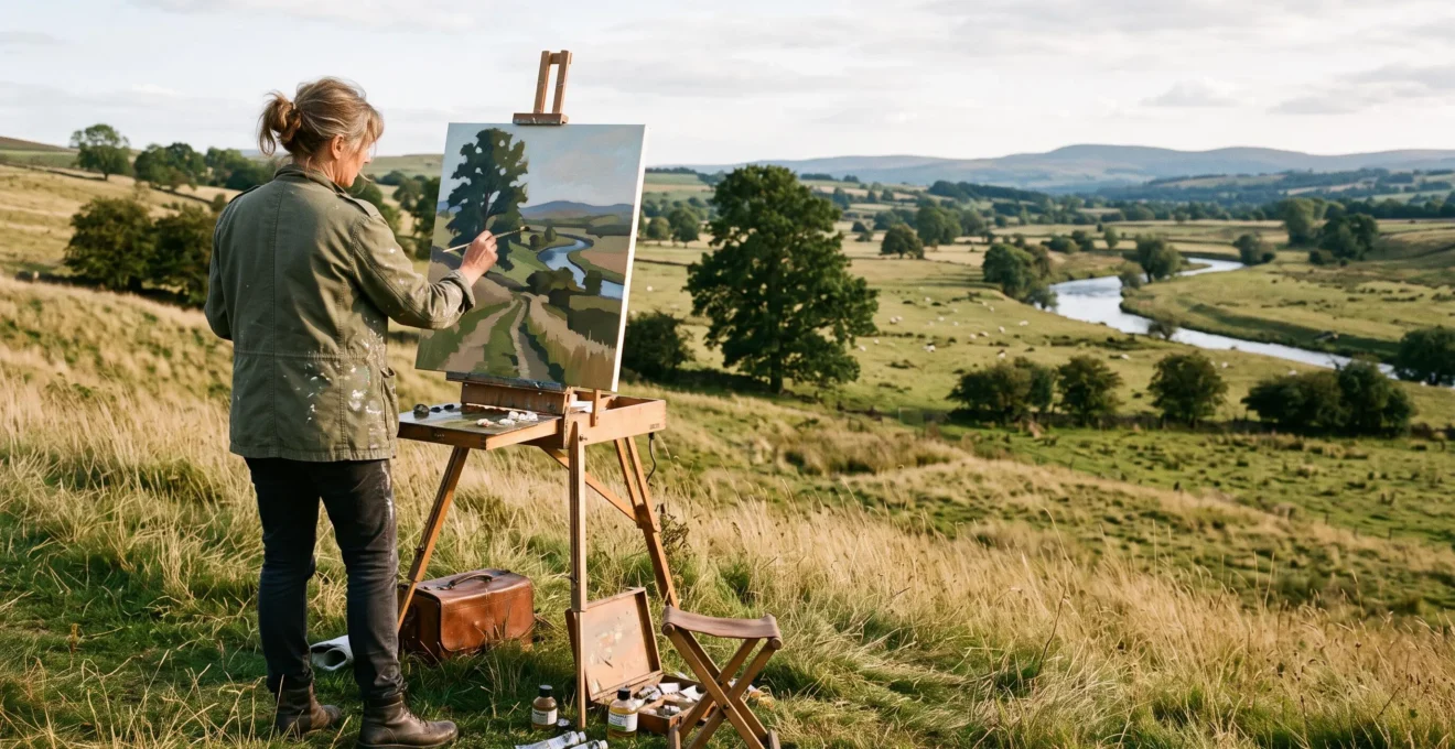
A hillside scattered with trees, rocks, grasses and winding streams can be extraordinary to experience but surprisingly difficult to paint or photograph. Everything competes for attention. An interesting branch interrupts a promising skyline; a patch of sunlight attracts the eye away from the intended subject; distant trees merge into an indistinct wall.
Coherent landscape composition begins with selection, not accurate transcription. Artists establish one dominant idea, organize supporting elements into larger shapes, and create a deliberate route through the picture. Individual trees, clouds and landforms matter because of their relationships, not simply because they are present.
That does not mean forcing nature into rigid geometry. A landscape can retain its irregularity, atmosphere and spontaneous character while following a clear pictorial structure. The challenge is learning which natural relationships to preserve, which distractions to suppress, and where carefully chosen adjustments strengthen the scene.
These decisions apply whether the final image is an oil painting completed outdoors, a studio landscape developed from field studies, or a photograph composed from an uncontrolled natural setting.
Landscape Composition: The Essential Principles
- Choose one dominant visual idea and simplify everything that does not support it.
- Organize trees, horizons, light and landforms into unequal but balanced relationships.
- Direct attention through contrast, edges and connected shapes, then test the arrangement before adding detail.
- Why Do Unedited Photographs of Beautiful Landscapes Often Feel Visually Disappointing?
- How Do You Decide Which Tree to Feature When a Forest Offers 200 Options?
- Classical Framing vs Impressionist Spontaneity: Which Landscape Approach Feels Timeless Versus Immediate?
- The Horizon Mistake: Why Centred Skylines Create Boring Landscape Compositions
- Plein Air Immediacy vs Studio Refinement: When to Finish Landscapes Outdoors Versus Indoors
- Why Do Symmetrical Compositions Feel Stable but Asymmetrical Layouts Create Visual Energy?
- Why Do Compositions Using 1.618 Proportions Feel More Satisfying Than Random Arrangements?
- How Do Paintings Control Where You Look First, Second, and Third Through Compositional Design?
Why Do Unedited Photographs of Beautiful Landscapes Often Feel Visually Disappointing?
Unedited landscape photographs often disappoint because an impressive experience does not automatically produce an organized image. While observing a landscape, people shift their attention between selected details and often overlook competing information. A camera records everything within its frame. Without deliberate composition, background clutter, distracting highlights and unrelated shapes may compete with the intended subject.
Imagine arriving at a valley where sunlight touches distant hills while several trees frame a winding river. In person, attention moves naturally toward the illuminated distance. A wide photograph might instead give equal prominence to bright foreground stones, tangled branches and empty patches of grass.
The photograph may be faithful to the scene yet fail to communicate what made the experience compelling.
The distinction is between scenic beauty and pictorial order. Scenic beauty belongs to the encountered environment. Pictorial order depends on relationships established within the rectangular image: dominance, subordination, balance and directional movement.
Moving to another viewpoint can improve those relationships, but relocation alone cannot resolve every competing element. Sometimes the solution is to crop an unnecessary foreground. Sometimes it involves waiting for light to isolate the subject. A painter may also combine nearby shapes, reduce contrasts or adjust the placement of a branch without losing the landscape’s essential character.
Classical landscape painting offers an instructive example. In Claude Lorrain’s Landscape with Hagar and the Angel (1646), foreground trees frame the scene while the landscape draws attention toward distant buildings. The National Gallery‘s analysis of Claude Lorrain’s Landscape with Hagar and the Angel identifies this spatial progression as an important feature of the composition.
Its lesson is not that every picture needs framing trees. It is that even complicated scenery can contain a recognizable visual route.
Try examining a disappointing photograph with three questions:
- Which single element should attract attention first?
- Which existing shapes could connect that element to the rest of the landscape?
- What would become clearer if a distracting highlight, branch or texture were reduced?
As a hypothetical exercise, take a cluttered woodland photograph and make two thumbnail sketches. Copy its major shapes in the first. In the second, merge several trees into one dark mass, retain a lighter opening and emphasize a curving path toward it. Compare which thumbnail expresses the woodland’s character more clearly.
Once that distinction becomes habitual, an overwhelming landscape becomes a collection of possible relationships. The next decision is identifying which natural element deserves to lead them.
How Do You Decide Which Tree to Feature When a Forest Offers 200 Options?
Choose the tree that performs the strongest compositional function, not necessarily the oldest, largest or most beautiful specimen. A useful focal tree has a readable silhouette, distinctive character and a position that helps organize surrounding shapes. Its trunk, canopy or directional gesture should connect naturally to the intended movement through the landscape.
Dense woodland provides almost unlimited possible subjects. Attempting to evaluate every tree individually creates unnecessary complexity. Instead, assess a few promising candidates against three practical criteria.
- Silhouette clarity: Does the trunk and canopy separate from the background, or disappear among similar forms?
- Individual character: Does a leaning trunk, unusual branching pattern, species-specific shape or visible age make the tree recognizable?
- Structural usefulness: Can the tree anchor a major diagonal, balance an open area or provide an entry point into the picture?
A twisted oak with an unmistakable profile might become the focal point of a quiet woodland painting. In another scene, a simple vertical birch could work better because it interrupts a long horizontal bank and establishes a clear contrast of directions.
Selection is only the beginning. Once the focal tree has been chosen, the surrounding forest must become subordinate.
In practical terms, draw the chosen trunk with a decisive contour while grouping neighbouring trunks into broader value shapes. Allow some branches to merge visually. Simplify background foliage into alternating areas of light and dark rather than describing every leaf cluster.
Reserve selected sharp edges, strong contrasts and identifying details for the main tree. This concentration makes its importance easier to recognize without requiring artificial exaggeration.
A botanical illustration and a landscape composition may depict the same woodland but answer different questions. Botanical illustration often prioritizes the identifying characteristics of a specimen. Landscape painting can subordinate those characteristics to atmosphere, spatial relationships and the overall visual statement.
Neither purpose is inherently superior; the important point is knowing which one guides the picture.
The most useful question is therefore not, « Which tree deserves to be recorded? » It is, « Which tree helps everything else belong together? »
After selecting a focal subject, artists still need a broader visual language for surrounding it. Classical and Impressionist landscape traditions offer contrasting approaches to that challenge.
Classical Framing vs Impressionist Spontaneity: Which Landscape Approach Feels Timeless Versus Immediate?
Classical landscape compositions often emphasize enduring structural relationships through balanced masses, layered depth and carefully arranged framing. Impressionist landscapes tend to emphasize immediate perception through changing light, color and lively handling. Neither approach guarantees timelessness or spontaneity: classical organization can become rigid, while apparently spontaneous work can depend on sophisticated compositional judgment.
The fundamental difference concerns how the artist establishes order.
In a classical approach associated with painters such as Nicolas Poussin and Claude Lorrain, a landscape may be organized into clear foreground, middle-ground and background relationships. Trees, architecture, distant hills and open sky contribute to a broad structural design.
The viewer can recognize the picture’s underlying arrangement even when its narrative figures or atmospheric effects are reduced.
Impressionist painters such as Claude Monet and Alfred Sisley frequently gave greater prominence to observed light, color relationships and the changing character of ordinary scenery. A cropped foreground, interrupted form or seemingly casual viewpoint could become part of the composition rather than something requiring correction.
The National Gallery of Art‘s overview of Impressionism identifies fleeting effects of light and color, personal expression and artistic process among the movement’s important concerns.
These characteristics distinguish artistic priorities without establishing that Impressionist compositions were unplanned or exclusively painted outdoors.
The practical differences become clearer when both approaches are compared directly.
| Compositional decision | Classical emphasis | Impressionist emphasis |
|---|---|---|
| Primary organizing principle | Deliberate arrangement of major forms and spatial planes | Relationships observed through light, color and immediate perception |
| Framing | Foreground masses and controlled openings | Potentially abrupt cropping and more informal viewpoints |
| Handling of detail | Detail supports a planned structural order | Brushwork and color relationships help convey the observed effect |
| Characteristic risk | Excessive regularity or predictability | Competing accents or insufficient large-scale unity |
| Useful when | The main idea concerns depth, monumentality or organized form | The main idea concerns atmosphere, changing conditions or immediacy |
These are working distinctions rather than fixed rules for every historical painting. Individual artists routinely crossed such boundaries.
The more useful alternative to choosing one tradition exclusively is structural planning without sacrificing perceptual freshness.
Begin with a small tonal sketch identifying the major masses. Then, while painting, allow the precise shapes of clouds, reflections and colored accents to respond to actual conditions. Keep the larger design stable while leaving room for observation to influence execution.
A practical test is to imagine the same arrangement rendered with very different brushwork. Would its dominant shapes and visual route remain convincing?
If so, its foundation is probably not dependent on style alone.
This distinction becomes especially important at the horizon, where one apparently simple line can determine the balance of the entire landscape.
The Horizon Mistake: Why Centred Skylines Create Boring Landscape Compositions
A centred horizon can weaken a landscape when it divides the picture into two equally prominent halves without establishing a clear subject. Sky and ground then compete for attention instead of supporting one another. However, a central horizon is not automatically a mistake: it can be effective when reflection, symmetry or deliberate stillness supplies the composition’s organizing idea.
The critical issue is which part of the picture should dominate.
Placing the horizon relatively low gives the sky more space. This can emphasize dramatic clouds, subtle atmospheric transitions or an approaching weather system. A narrow strip of land may provide enough visual weight to anchor the image.
Placing the horizon relatively high gives more space to foreground and middle-ground relationships. Paths, fields, rocks and overlapping vegetation can then establish a deeper journey toward the distance.
Neither position is inherently better. The location should reflect the image’s subject.
Consider two hypothetical studies made from the same valley. In the first, an approaching storm provides the main drama, so a low horizon gives the changing sky priority. In the second, the important subject is a winding footpath crossing varied terrain, so a higher horizon allows the land to carry the composition.
The scenery remains essentially the same, but the pictorial statements differ.
Moving the horizon is not the only correction available. When a centred horizon serves the picture’s intention, several other devices can prevent the composition from becoming static.
- Interrupt the horizontal boundary: Allow a tree, building or rising landform to connect the sky and ground.
- Vary the skyline’s rhythm: Replace an uninterrupted band with changes in height, direction and contour.
- Differentiate adjacent values: Give the sky and land distinct tonal functions, even when their brightness is similar in places.
- Create an alternative visual route: Use a winding river, diagonal shadow or sequence of foreground forms to guide attention.
The horizon can also be partially hidden. In wooded landscapes, the transition between land and sky may be distributed among branches, openings and distant hills rather than forming one continuous line.
In Claude Lorrain’s Landscape in Latium with Farm Laborers, the Getty Museum identifies revisions that lowered a mountain peak and opened more space for the sky. The example demonstrates that adjusting the relative area occupied by natural forms is a legitimate compositional decision, even in a drawing with spontaneous qualities.
The practical habit is to make several small horizon studies before committing to a large painting. Compare what dominates in each, rather than measuring each against a fixed placement rule.
Once the fundamental arrangement works, a different problem emerges: determining whether the landscape should be resolved under changing outdoor conditions or developed further in the studio.
Plein Air Immediacy vs Studio Refinement: When to Finish Landscapes Outdoors Versus Indoors
Finish a landscape outdoors when its central purpose depends on direct observation of fleeting light, atmospheric relationships or spontaneous handling. Move the work into the studio when drawing accuracy, complex structural revisions or layered development matter more. A combined approach is often effective: capture the essential outdoor relationships first, then refine without losing the original visual intention.
Painting outdoors forces decisions under changing conditions. Shadows lengthen, clouds move and reflected colors shift. These constraints can encourage the painter to simplify and identify the scene’s most important effect quickly.
They can also undermine the picture if constant changes tempt the artist to repaint unrelated passages without a stable plan.
Studio work provides greater control over time, working conditions and scale. Shapes can be rearranged, tonal relationships reconsidered and larger compositions developed from several studies.
Its danger is equally practical: the more refined a picture becomes, the easier it is to erase the quality that made the subject worth painting.
The best choice depends on the dominant quality of the intended painting.
| Main priority | Preferred workflow | What to protect |
|---|---|---|
| Fleeting sunlight or weather | Resolve the main relationships outdoors | The original color and value effect |
| Loose, immediate brushwork | Complete outdoors when conditions permit | Decisive early marks |
| Complex drawing or spatial organization | Outdoor block-in followed by studio work | The field study’s structural intention |
| Large or highly developed landscape | Field studies supporting studio refinement | The observed character of the location |
Historical landscape practice provides examples of work that does not fit a simple outdoors-versus-indoors division. The Getty Museum describes Claude Lorrain’s Landscape in Latium with Farm Laborers as probably sketched on location, while also identifying changes to its mountain forms. This combination is a useful reminder that direct observation and deliberate revision are compatible.
A reliable combined workflow begins by making a field study that records the central light pattern, major value masses and dominant color relationships. Photograph the scene for supporting information, but do not expect a photograph to preserve every perceived color or atmospheric relationship accurately.
Brief written notes can retain details that the camera and later memory may not convey: the warmth of a sunlit bank relative to the sky, the softness of a distant ridge, or the particular shadow arrangement that unified the view.
A Five-Step Field-to-Studio Composition Checklist
- Write the visual intention: Record one sentence identifying the landscape’s main effect or subject. Deliverable: a clear statement of purpose.
- Test three arrangements: Draw three small thumbnails varying the dominant mass, horizon or focal placement. Deliverable: three comparable composition sketches.
- Establish the value structure: Reduce the selected arrangement to a few connected light, middle and dark masses. Deliverable: one readable tonal study.
- Capture field-specific evidence: Record the essential color relationships and take supporting reference photographs where useful. Deliverable: an annotated color study with references.
- Verify the refined composition: Compare the developing painting with the field study and identify whether its original effect survives. Deliverable: a short revision list focused on preserving that effect.
The fifth step is particularly important. Studio refinement should resolve weaknesses in the painting’s organization, not merely increase the amount of detail.
Whether completed in one session or over several, the image still needs equilibrium. That balance may be quiet and symmetrical, or dynamic and deliberately unequal.
Why Do Symmetrical Compositions Feel Stable but Asymmetrical Layouts Create Visual Energy?
Symmetrical compositions often feel stable because major visual weights appear evenly distributed around a central axis. Asymmetrical layouts introduce differences in size, position, darkness or visual complexity, creating relationships that the viewer must resolve. This inequality can produce movement and tension, provided the overall picture remains balanced rather than merely scattered.
Symmetry offers a clear structural principle. A tree reflected in still water, a formal avenue or a central opening between similar woodland masses can establish repose and monumentality.
It can be especially useful when the desired feeling is quiet, solemn or deliberately ordered.
Asymmetry uses a different kind of organization. A large pale hill on one side of the picture may be balanced by a much smaller but darker group of trees on the other. A prominent tree positioned away from the center may be counterweighted by an open patch of sky or a secondary landform.
The two sides are different, yet neither necessarily overwhelms the whole.
Effective asymmetry is balanced inequality, not accidental imbalance.
A useful way to judge it is to consider visual weight rather than physical size alone. Dark values, strong edges, isolated shapes and concentrated detail can increase the prominence of an element. Their effect also depends on neighboring forms and the entire image.
Consider a hypothetical coastal painting. A narrow dark headland occupies one side, while a broad expanse of pale water occupies the other. The headland may carry enough emphasis to balance the open area even though the two forms differ greatly in size.
The emotional statement should determine which arrangement is appropriate. A symmetrical composition can support a tranquil reflection scene; an off-center arrangement may communicate shifting weather, a winding route or the irregular rhythm of woodland growth.
Neither structure has an exclusive claim to beauty or expressive force.
Before painting details, reverse a thumbnail horizontally or study it at a distance. Ask whether the major masses feel deliberately related. If one element dominates unintentionally, try changing its contrast or the size of a neighboring mass before moving the focal subject.
The search for balanced inequality has also encouraged artists and theorists to explore proportional systems, including the golden ratio. Such systems can help organize decisions, but their claims require careful interpretation.
Why Do Compositions Using 1.618 Proportions Feel More Satisfying Than Random Arrangements?
The golden ratio, approximately 1.618 to 1, offers a way to divide an image into unequal but related proportions. Artists can use it to position a focal point, horizon or major mass without relying on a central division. However, scientific evidence does not establish that golden-ratio arrangements are universally more satisfying than other compositions.
In a golden-section division, the relationship between the larger and smaller parts follows the same proportion as that between the whole and the larger part. Applied to a rectangular picture, this places a potential dividing line at approximately 61.8% of its width or height, measured from one side.
This produces a useful alternative to splitting the image exactly in half.
The appeal of a proportional framework is practical. When a landscape contains many plausible focal positions, a starting grid reduces uncertainty and encourages the artist to consider the relationship between major areas.
For example, a painter may initially place an isolated tree near a golden-section vertical and allow the open meadow to occupy the larger remaining area. A horizon may likewise be tested near a golden-section horizontal.
These choices are starting hypotheses, not proof of compositional success.
Golden-ratio placement should not be mistaken for a universal law of visual beauty.
In a 2015 experimental study, Stefan Stieger and Viren Swami examined preferences for artworks with foreground objects positioned according to the golden ratio or alternative placements. Their explicit and implicit evaluations did not reveal a clear preference for the golden-ratio positions tested.
The findings, documented in Stieger and Swami’s 2015 study on golden-ratio preferences in art, challenge claims of automatic aesthetic superiority. They do not establish that the golden ratio can never produce successful compositions.
Nor does observing a golden-ratio relationship in a historical artwork establish that its creator consciously used that construction.
A proportional grid is most useful when considered alongside subject matter, directional movement, value relationships and the expressive purpose of the image.
For a practical field exercise, place a focal tree at a golden-section intersection in one thumbnail. Create another with the tree closer to the center, and a third with a more pronounced off-center placement. Keep the main tonal relationships similar.
Compare the three arrangements by asking which creates the clearest focal emphasis and most convincing balance. Adjust the preferred version by eye.
The strength of the golden ratio lies in its ability to provide a repeatable initial framework, not in guaranteeing that a viewer will prefer the result.
Proportion can organize the space, but it cannot determine every moment of attention within it. The final requirement is a hierarchy that guides viewers through the completed landscape.
Key Takeaways Before the Final Composition Test
- Preserve a clear dominant idea even when the scene contains numerous attractive secondary elements.
- Use horizon position, unequal visual weights and proportional guides to strengthen relationships, not to obey arbitrary formulas.
- Evaluate the finished arrangement by the sequence of attention it creates, rather than by the quantity or accuracy of its details.
How Do Paintings Control Where You Look First, Second, and Third Through Compositional Design?
Paintings guide attention by controlling contrasts, edges, color intensity, placement and connections between shapes. A focal element usually attracts the first glance, while directional forms and supporting masses encourage further exploration. Artists cannot guarantee that every viewer follows an identical sequence, but they can make an intended visual journey clearer and reduce unwanted competition.
This hierarchy is what finally transforms a collection of scattered natural objects into a coherent picture.
A landscape might contain an illuminated tree, a winding stream and distant hills. The tree receives the strongest localized contrast and clearest edges. The stream connects its foreground setting to the middle distance. Softer hills and a restrained sky provide spatial context without demanding equal attention.
The viewer is offered a progression: focal tree first, stream and deeper landscape second, supporting masses and atmosphere third.
This is not a mechanical order imposed on the viewer. It is a design intention established through relative emphasis.
Contrast creates attraction, while connected shapes help sustain movement. A light patch against dark foliage may stand out, but its exact role depends on the picture as a whole. Strong peripheral accents can interrupt the intended route, particularly when they compete with the focal element.
For practical control, examine four variables:
- Value contrast: Concentrate the most important light-dark relationships where attention should begin.
- Edge definition: Use selected sharp edges at the focal area and allow less important forms to merge or soften.
- Color saturation: Reserve stronger color accents for meaningful passages when that supports the desired effect.
- Directional connections: Arrange paths, rivers, shadows, branches and overlapping contours so that they support movement through the scene.
Each variable can also create problems when used indiscriminately. A sharp foreground twig, an isolated bright stone or an intensely colored cloud may become an accidental focal point.
Remove or reduce such distractions only when they interfere with the intended statement. Some landscapes benefit from quiet visual pauses and secondary attractions rather than a continuously obvious path.
Once the composition is established, an effective self-critique can reveal structural problems before further detail makes them harder to correct.
First, squint at the image until smaller details become less distinct. Identify the shape that appears most prominent. If the intended focal point disappears into its surroundings, reconsider its contrast or the relationship between neighboring masses.
Second, trace the visual route from that focal point toward the deeper landscape. Look for interruptions caused by disconnected shapes, unnecessary highlights or strong edges at the margins.
Third, inspect the picture at thumbnail size or from a greater viewing distance. Check whether the main shapes remain legible without the help of descriptive detail.
Finally, ask whether the composition’s emotional intention survives. A quiet misty landscape should not require the same hierarchy of sharp accents as a dramatic scene organized around a sudden shaft of sunlight.
A successful design is not necessarily one that dictates every glance. It is one in which the dominant idea remains recognizable while the remaining elements reward further exploration.
For the next landscape, begin with three small thumbnails, identify one dominant natural element, and test the viewing route before committing to the final surface. A coherent composition emerges through these selective decisions, not through the attempt to represent every object the landscape contains.
How many focal points should a landscape painting have?
A landscape often benefits from one dominant focal area supported by secondary points of interest. Multiple attractions are possible, especially in complex narrative or panoramic scenes, but they should have different degrees of emphasis. If several unrelated areas compete equally, the viewer may struggle to recognize the picture’s main intention.
Should painters remove natural objects that interfere with composition?
Selective omission, simplification and rearrangement can strengthen a painting when they preserve the subject’s recognizable character. A distracting branch may be suppressed or a collection of stones reduced to a simpler mass. Documentary or scientific illustration may require greater fidelity, so the appropriate degree of alteration depends on the work’s purpose.
Can a landscape composition work without an obvious leading line?
Yes. Leading lines are only one way to organize attention. Repeated shapes, tonal contrasts, overlapping planes, changes in scale and carefully controlled openings can also establish visual relationships. A calm landscape may rely on broad horizontal rhythms and subtle transitions rather than a path or river directing the viewer toward a distinct destination.
What is the fastest way to test a complicated outdoor composition?
Make a small thumbnail using a limited number of value groups. Ignore leaves, individual grasses and minor textures. Check whether the subject is immediately identifiable, whether the large masses feel balanced and whether the principal shapes connect meaningfully. If the simplified version is unclear, additional detail is unlikely to solve the underlying structural problem.
Do landscape photographers and plein air painters follow the same compositional principles?
Both can use focal hierarchy, balance, framing, value contrast and visual movement. Their practical options differ. Photographers can reposition the camera, adjust framing, select timing and make suitable edits, while painters have greater freedom to simplify, omit or rearrange observed elements directly. In both practices, clarity depends on selecting relationships that support the image’s purpose.